Overview
A design challenge to redesign Ria Money Transfer's core send flow. By running a heuristic evaluation and competitor analysis, I identified that users were forced deep into the app just to see live exchange rates. I redesigned the home screen and calculator to surface rate information upfront — cutting unnecessary steps and building the confidence users need to complete a transfer.
My Role
Product Designer - Conducting heuristic evaluation and competitor analysis. Designing hi-fidelity prototype for home, watchlist, market, and live news page. Establishing a style guideline and creating reusable components on Figma.
Duration
4 Days
Expected Impact
Reducing user frustration and saving time.
Increasing user confidence and encouraging transactions.
Problem Restatement
Highlight
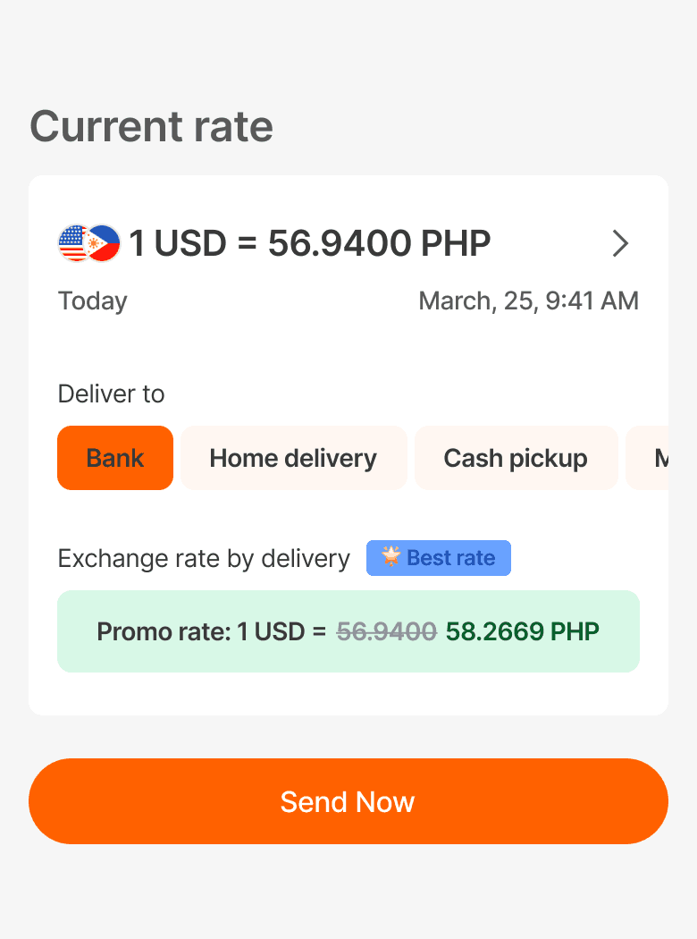
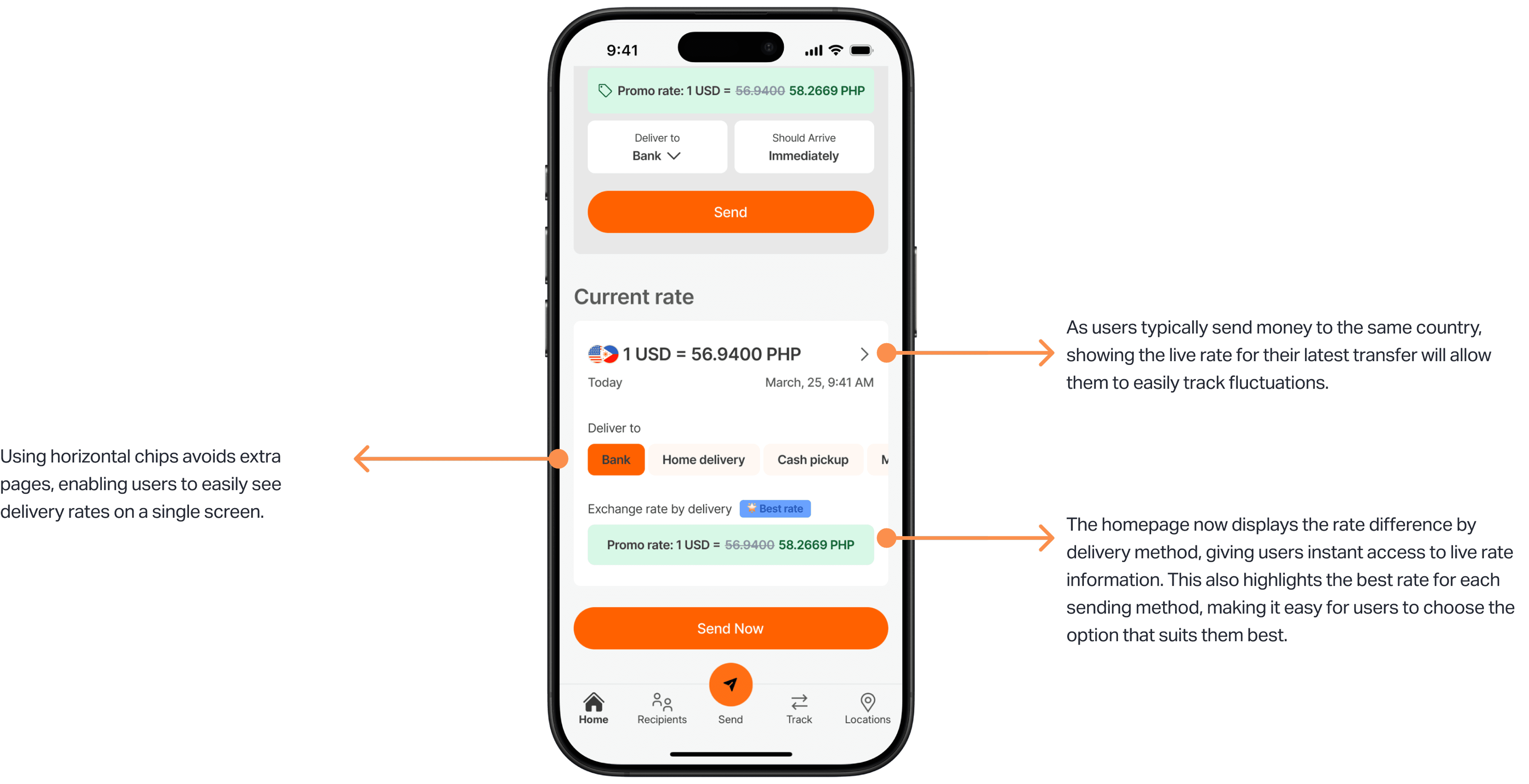
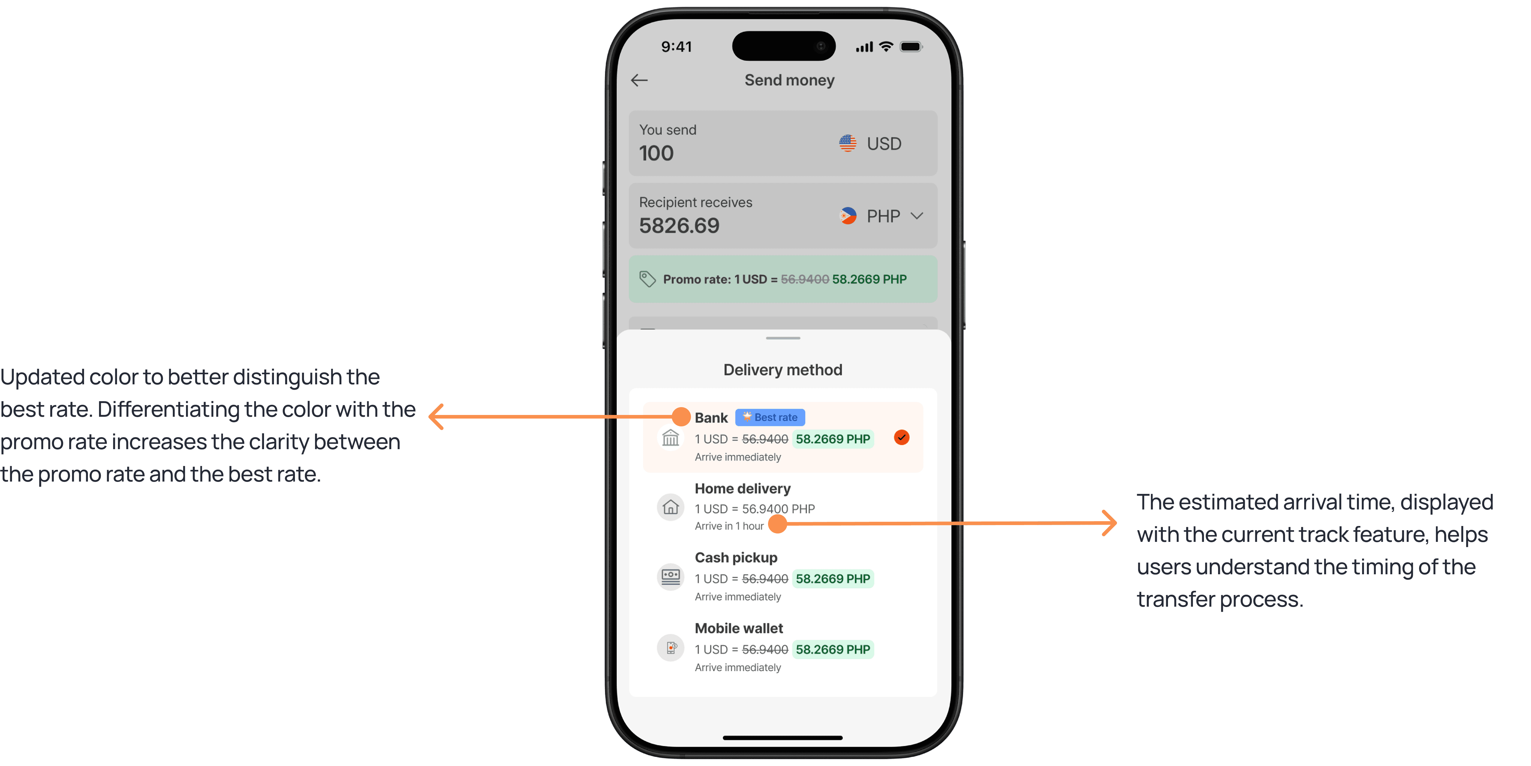
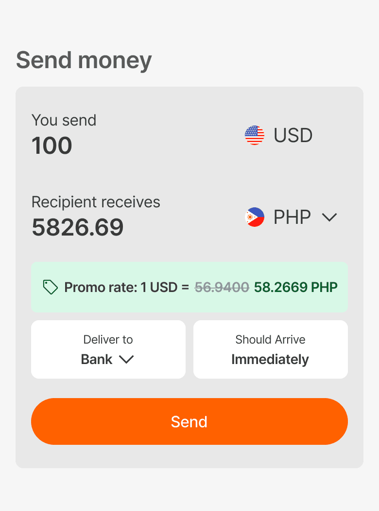
Improving system cue visibility, simplifying actions for repetitive money transfer users
Discover
As a repeat sender in the US, I want to reliably and efficiently send money to my loved ones in my home country, ensuring I get the best possible value without constant monitoring rate changing and repetitive actions.
-Repetitive user from the US
Deliverables HIghlights
With color-coded tags, users can easily see which issues are currently related to the rise and fall of the market.
Easily save the tag and turn on the notification on the specific issue they want to track.
A newly updated summary section lets users easily follow daily updates of stocks they are interested in.
View live stock updates in chronological order in the news section, allowing users to read updates while checking related news.